Friday, 9 December 2011
Song Details Lock The Locks By The Streets
Lock The Locks is one of the tracks that I was most looking forward to listening to from The Streets’s new album Computers & Blues, and after hearing it I am glad that I’m not coming away feeling disappointed. Claire Maguire switches her vocal style up effortlessly to provide an instantly catchy hook and Mike Skinner does his thing as usual, signing off on the final track on the album with a bang.
Computers and Blues is the fifth album by The Streets and the final one Mike Skinner plans to release under this alias, officially released in the United Kingdom on 7 February 2011. It contains 14 songs, including an appearance from British singer-songwriter Clare Maguire which of course is in this song lock the locks.

Computers And Blues finds Mike Skinner calling time on his Streets name, and on this album closer he raps about moving on. Said Skinner to The Daily Record: "Recording this song did make me emotional, but it didn't make me emotional about The Streets. It made me emotional about leaving jobs, which I have done... though not for a long time, admittedly."
The song features British singer-songwriter Clare Maguire, who was announced on January 3, 2011 as coming in fifth place in the BBC Sound of 2011 list of the most promising new artists. She told Digital Spy about the collaboration: "Being in the studio with Mike Skinner was amazing - apparently Mike said to my manager while I was singing, 'Oh I didn't realise she could write as well!' He took away the chorus I'd come up with it and put his own song around it, which is just insane and brilliant."
Shooting Schedule
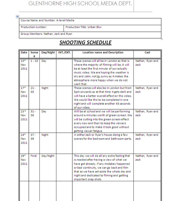
Friday, 11 November 2011
Track Release Form


Tuesday, 8 November 2011


Assessment - Final Planning check 08th Nov SJA
WWW:
- Ryan, very good to see you have changed some posts to fit the new song you have chosen.
- Post on 'technical tutorials' is very good - I am pleased you have responded to some of my earlier feedback
- I really liked your photoshop work on Advert Designs. Really good layout, use of colour and stylised effects. Looks very 'urban' and suits your genre well. I hope you continue down this direction for your digipak cover design.
EBI:
- You still have al arge amount of work to do to get this section of your blog complete and up to an 'B' standard Ryan. You have the 3 hours in lesson today - and that is it. I do understand that your group had a change of song, but there is not a great deal of evidence to suggest that you have spent enough time outside of lessons on developing posts and changing planning to suit your new song.
- Lots of posts are missing and your group needs to work together to get these sorted out today:
- - Roles - needs developing. I don't really want to see a picture of you holding a can Ryan - take it seriously please and think carefully about the specific roles you, nathan and jack are going to take on. Pics of everyone needed - and clear explanation of what and why people are allocated certain roles.
- - Song details - missing?
- - Lyrics Annotation / Image Annotation / Concept - all of these need updating for your new song
- - Storyboards?
- - Props / costumes - missing?
- - Location shots - these have no written explanation? I have no idea from this post what you intend to do at each location - it is just a collection of images that are meaningless. Why did you choose these locations? How do these locations represent your artist? I can see that these photos are just from Google images - you need to make the effort to scout out your own locations for filming interior and exterior shots - and actually bother to go and take photos of these...
- - Shooting schedule - missing? (We will not let your group go anywhere to film without these posts complete)
- - Location permission letters?
- - Talent release form?
- - Track permission letter?
Lots of work to do Ryan. You achieved an 'A' in media last year - but this was primarily because you were in a group that planned out the film sequence so thoroughly and meticulously, and this paid off in a really successful film... You were very lucky to be a part of that group - and I think you know that. You wanted to be with your friends to shoot the music video - but it will only be successful if all of you are prepared to plan thoroughly and think every detail through.
Currently there is so much work missing from your blog, I have to mark it as Improvement Needed.
Currently there is so much work missing from your blog, I have to mark it as Improvement Needed.
You have 3 hours to complete to a 'B' / 'A' standard today. This is actually possible - your group needs to stop wasting time and develop a far more mature approach to completing work. If you understand this, you can work together to get the work done.
SJA
Sunday, 6 November 2011
Possible Locations

This shot represents a park area which is in around Autumn when it is cold. The reason we took this picture is because this will be the weather we will be filming in and we would like to exaggerate the colours of the leaves as they will be part of our colour scheme. Also the emptiness of the area adds to the effect and mood of 'loneliness'. Additionally, it suits the genre and mood of the song as its not a fast paced rhythm, it's a slow based one with a lot of feeling in the lyrics. So by choosing areas like this as such, it will give us a great opportunity to do panning shots, off-cuts and many more. The shot we are looking to film here is a line or two of the third verse and he the actor would be basically walking sidewards on to the camera (which will walk along side him) and the actor will lip sync whilst looking forward and maybe glimpsing at the camera for effect.
Worcester Park: We are going to film in Worcester park high street as we know this high street is pretty busy, and it also contains many every day stores and shops. This location is essential for our music video as our video is stereotypical everyday lfie for this man who our song is about. We thought that specifically we could use this certain part of Worcester park as there is a grocery store right beside where we filmed, and this was very relevant and related to our song, as it is fast paced fiesty kind of store. We thought that if we could get our song to relate to true life as much as possible this may help more of our viewers to try and fit themselves into the song.

Hamptons: Hamptons will be used in our video as part of the chorus where I will be lip syncing as the scenery around there is very nice, and will provide the viewer enjoyment and aesthetic appreciation of the outdoors when watching our video. It is seen as quite a posh and well looked after place, and as my character is in a bad way, I will be at the top of the hill, looking down upon the going's on around me as if everyone is in a better position than me. Being on top of the hill will create a real contrast with the lyrics as they will be saying "Lost it all to this life" and by being up high it suggests the main character is in a high authority position, when infact he is at a sort of all time low.
Home: Another location that we will have is in my home as the start of the song talks about the main character waking up in the story behind the lyrics. The footage filmed in my house will not be long, however it is necessary for out video to begin with. The initial waking up of the main character is key to the storyline as the lyrics and the mood of the song suggests that the days happenings for this character are pretty routine and he seems stuck in the cycle and cannot get out. The props in this sequence will need to be specifically placed in order for the audience to get the initial storyline.

The second location is of London. We believe that using this popular location will be very beneficial as it has a lot to offer. For example, London has plenty of lovely sceneries which would make get frames and shots. In the photograph it shows the houses of parliament which is a popular destination, and by including it in our music video, it gives an opportunity for people to relate themselves to the location. This location could be used for multiple purposes but it could be specifically used for filler shots and establishing shots. At night time London offers a beautiful and attractive appearance which will make our music video look even more appealing

This is another location that could be specifically used when lip syncing. Our idea around using this as a location is by filming the busy background and then using that onto a green screen and then gets someone to lip sync over it. This effective will look as if the singer is there at the time whilst everyone is walking around. The background footage will be sped up, therefore making the singer stand out and put to the centre of attention.

Album Advert Design Ideas

This is an example of an album advert design. This advert is only a draft and includes only a few of many ideas. As you can see we have included an urban and street theme throughout, which can easily noticed by the types of costume and also the font type. The clothing on the characters is very casual such as jeans, jumpers, trainers etc. The font is very basic but as a slight bubble effect added to it to make it seem appealing to a younger audience.
Furthermore, another feature that allows the audience to understand the street and urban theme and genre is the silhouette in the background. For example, this is a silhouette of a city which could also have connotations to where some of their music videos are shot. Also the black silhouette contrasts very effectively allowing the colours of the costumes to stand out more and make them the centre of attention. Not only the clothing but the title contrasts well, which also makes it stand out and catch the audience’s eye. For example, blue and red are completely opposite colours causing them to stand out against one another, and attract the audience to read the title, which is also the band name.
Moreover, the use of rule of thirds is very significant. For example, the three characters are equally spread apart on the album advert meaning that they are all caught by the audience’s eye
Brand Identity Planning Sheet

This is our brand identity planning sheet. As you can see it includes many of our ideas including:
· The messages that we want to get across to our audience
· What our band is about
· What type of genre we perform music to
· Font details and ideas
· Design elements
· Target audience
Costume Ideas

This is an image that I have drawn to show different types of costumes that could feature within our music video. For example, this character is show wearing a smart suit, which seems as if he is going out somewhere nice or dressing to impress.
The character is wearing a dark blue suit jacket with smart brown trousers and black polished shoes. This could be an idea of a costume within our music video when the main character goes to see the girl at the train station.
 Moreover, we are also thinking of casual clothing to reflect on the urban and street theme. For example the image above is an example of a costume that could work well within our music video. For instance, this costume includes a hooded coat. Hoods are often stereotyped with gang culture and kids on streets, hence why we have included this coat as it could work well with our genre and theme. Also, I have included chinos as part of the costume. I specifically chose these as these are a current high street fashion, meaning that it could appeal to you a young and current market. Lastly, they are wearing boat shoes. These are also a popular trend with the target audience that we are trying to appeal to, hence why it is important to include things like this

Photo Shoot Schedule
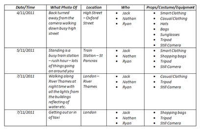
This is a photo shoot schedule which shows the times and date and what we will need for each photo shoot. For example, on 4/11/2011 we have chosen that we going to a busy high street such as Oxford Street, and we will need props, costumes, and equipment including smart and casual clothing, hats, and a still camera.
Creating a photo shoot schedule makes things much more organised, which therefore allows you to know what you are going to be doing on those certain days.
Album Cover Design ideas

Here is another example of an album that I have created. In this example it uses a variety of effects including colour contrast which makes it look very effective and different to others. Moreover, instead of making the whole cover black and white I made sure that I kept the band name in red. I purposely did this to ensure that it stood out against the black background.
Advert Design Draft

Here is an album advert which I created. I created this album advert through the programme called Photoshop. To enable the way that it looks now I had to use a variety of effects and features that Photoshop has to offer. For example, I firstly imported the photo to Photoshop. I then used previous knowledge to apply a range of effects to the picture to make it look effective and appealing. Moreover, I then had to download a suitable font type from ‘daFont’ which I thought would be suitable and attracting to a variety of audiences. After doing this I then put it all together making sure that it looked professional and appealing. For a few extra pieces I extracted the ministry of sound logo and the blackberry barcode scanner to the album advert. By including little extra’s such as the Blackberry barcode enables you to appeal to a younger audience, as data shows that the majority of Blackberry’s are used by people between the age gaps of (16-20). In addition, the use of the ministry of sound logo makes the band and album advert look much more alluring as customers can then see that it is a professional.
DaFont.com

DaFont.com example

Photoshop - Apple Mac

Tuesday, 1 November 2011

Thursday, 20 October 2011
Roles
As a group we have allocated many roles and responsibilities throughout the group. For example, roles that will be assigned amongst our group are:
This picture is of 'Nathan Bedford' he will be in charge of the props as it's important to get everything organised for filming and practice shots. This role will consist of gathering clothes, props and making sure he ask round for the things we need. His final job is to sort out the lighting as he volunteered for this role and he will basically set up all the lighting before hand and make sure it's in great shape to film in. It will need to be perfect and really effective as it plays a big part in the music video weather it helps to show status, or contrasts of character or colours.

This is a picture of me, in the kind of clothing that our character will be wearing in the video. You can see the casual pair of chino's and a nice t-shirt also a nice casual pair of shoes. While these items of clothing are relatively normal, we will be using these kind of items whilst creating our video. My body posture here is very laid back and natural and you can tell this from the hand in the pocket and pretty neutral smile. As there is only 1 singer in the song I have been chosen to do all the lip syncing, originally we decided to split up the verses between us, nut this may have been confusing for the audience, trying to figure out different stories within the music video. I have been chosen for the lip syncing role because I am confident in front of camera and i regularly watch up to date music videos, from artists like the streets, so I am confident with reinacted specific body language, and portraying certain moods over to the audience.

This image shows a member of the group, and his name is Jack. As you can see he is very casual and calm. You can tell this by his body posture but he also significantly has his hand in his pockets. Having his hand’s in his pockets can suggest to the audience that he is very laid back. His costume or clothing is up to date with current trends, which could appeal to a large audience. We will all take roles and responsibilities throughout the making of our music video. For example, we all are taking turns in the editing, filming and acting side of the music video. In addition, we all have similar styles and tastes; therefore we will all choose locations and props.
This is a picture of me, in the kind of clothing that our character will be wearing in the video. You can see the casual pair of chino's and a nice t-shirt also a nice casual pair of shoes. While these items of clothing are relatively normal, we will be using these kind of items whilst creating our video. My body posture here is very laid back and natural and you can tell this from the hand in the pocket and pretty neutral smile. As there is only 1 singer in the song I have been chosen to do all the lip syncing, originally we decided to split up the verses between us, nut this may have been confusing for the audience, trying to figure out different stories within the music video. I have been chosen for the lip syncing role because I am confident in front of camera and i regularly watch up to date music videos, from artists like the streets, so I am confident with reinacted specific body language, and portraying certain moods over to the audience.
Sunday, 16 October 2011
Planning posts - checking your progress Oct 16th SJA
WWW:
- Your use of ICT to film a create a mini movie for the 'Initial Ideas' post is a good use of video in your blog to communicate and explain ideas
- The post on 'Lyrics Annotaton' is really detailed - good to see effort invested here
- The photograph you used for the Photoshop practice / CD cover design is really good - nice use of interesting angle and shadow here Ryan. The inclusion of the plane was a bit bizarre though - and I didn't think this worked??
- You blog posts ofr 'Planning' are not as up-to-date as they should be Ryan.
- You need to really improve your post for 'Technical Tutorials' - where is your Green Screen work and Final Cut editing? Include this and write a thoughtful written reflection on it.
- Posts on 'Roles' and 'Song Details' missing?
- Your group may need to rethink your song choice as there are aspects of the lyrics that are really inappropriate given that this is going to be submitted to the OCR exam board for your final A Level assessment. References to genitals, etc. need to be either edited out, or a new, more appropriate track from your genre needs to be selected. I will talk to Ms Ingram and the other Media teachers to see what your options can be on this.
Friday, 14 October 2011
Technical Tutorials
Publicity Photos- We used a school camera in order to take photo's that would help us to get an image of our genre. We used a variety of different locations however we were not allowed to go outside of school, so by using different angles and the use of the natural light, we were able to create images from different genres. Facial expression plays a massive part in a photo also, as a friendly more attractive look will be more appropriate for the pop genre rather than a grime or rock genre. We used a high quality camera to do this and then I put them al together in a video, with the appropriate genre music laid over the top of it.
Here is the final product of putting all of our images we took together in a video.


Here is the final product of putting all of our images we took together in a video.
Here is a picture of the green screen that we used in class to practice a small lip sync task. The green screen can be very effective as it is a lot budget way to make things look interesting; however it can sometimes make it look unprofessional if not done properly.
The downsides to the green screen are that people are unable to wear green as it will become affected by the effects. When setting up the green screen we also set up three lights that were carefully positioned and focused on the performer. We also set up three camera’s which were also focused on all the performers.
Chroma key
Chroma key compositing is a technique for compositing (layering) two images together.
A colour range in the top layer is made transparent, revealing another image behind.
The Chroma keying technique is commonly used in video production and post-production.
This technique is also referred to as color keying, color-separation, green screen, and blue screen.
It is commonly used for weather forecast broadcasts, wherein the news presenter appears to be standing in front of a large map during live television newscasts, but in a television studio it is actually a large blue or green background.
CD Cover Draft

This is our first draft of a Cd cover design on photo shop. We have never really used photo shop so it was a challenge to produce an okay product. While spending an hour on this CD cover design we came across a few WWW's and EBI's.
WWW - The album name has a double meaning, for example we have called it the 'plain' wall as the picture is of Ryan against a plan wall, but he is also looking up at a 'plane' making it different with a twist
WWW - The font of the album name goes with the genre of grime, which we downloaded individually for this product
WWW - When picking the background colour we came across a tool that picks a colour from the picture and basically copies that exact colour/shade making it really effective
WWW - We played around with a load of tools and effects helping us broaden our knowledge of photo shop, ready for the next time we use it
WWW - The actual picture we chose really represented our genre, with the low angle making him look big and the grimy scenario, a rough plain area
EBI - If we had more time to complete this draft, I reckon the final product of it would look much ore better, as we didn't have enough time to experiment
EBI - It would have been better if we included the artists name underneath the album or on the plain wall because we forgot to insert that
EBI - It may appear a little tacky with the plane in the background, so next time we will keep it more simple, but with a lot more meaning
EBI - We should of thought about lighting more so we could of exaggerated his feelings/emotions, and by using high or low key lighting it makes overall look better
EBI - Finally, we have all come to the decision that we should of thought about the costume and how we want the actor to appear to the audience, in our case we want a smart, big looking man
Tuesday, 11 October 2011
Concepts
When thinking about the concept of our music video, we need to ensure that we are fully aware of what is needed, and why regarding to locations, genre and props. When planning out what props to use, we decided that we were to keep it fairly simple, in order not to distract the audiences attentions away from what's actually important, which is the lyrics and the lip syncing. However, props that commonly appeared when devising our plan were; cigarettes, beer and a pool table. The reason these things were suggested, was due to the fact that our song is very much about this guy wasting his life away, and typical locations would be in a bar/pub, therefore would be a perfeect situtation to incoporate the beer and cigarettes into. Other featuring props to be included would be things such as betting slips, and fruit machines, reasons being because in the lyrics he talks about gambling and wasting all his money away.
Our genre was had to classify, so we classed it as rap/urban, and such artists that we fit into this category were Plan B, Jamie T and The Streets. There are many conventions of this genre that we will have to stick to when creating our video, being that the main artists features greatly in the majority of the video, and that the clothing that needs to be worn will be considered quite chavvy and common. Such items will be hoodies, jeans and common shoes such as Vans.
Locations that would be quite relevant to our genre would include things such as a launderette, pub, a house (for the waking up sequence), grimey settings, skate parks and other such locations.
The launderette could be a key focus in our video, as not only could we bass some of our music video there, we could incoporate an image from there into our digipak or make our advertisement out of it, as this is similiar to when 'The Streets' used this setting in his song 'Dry Your Eyes Mate', it fits in with the genre because it was rundown and scruffy, which will be perfect for our characters mood, being run down and unmotivated to do anything.
Also in the song, there is a lot of focus around him messing his life up and gambling on too many bets, thus we will need to include many gambling situations, for example in the betting shop, or on the fruit machine in the pub.
Monday, 10 October 2011
Image Annotation

Moreover, here is an image that I have annotated. The image is of the artist Jamie T that produces a large variety of music.

Song Details
The song we have chosen as a group is Lock The Locks by The Streets.

We have chosen the song as we all find it quite different to the majority of other songs from our genre. Our song is much slower paced and contains very meaningful lyrics. Not only does Mike Skinner sing in our song, but we also have a featuring female artist, and this helps to attract a wider variety of audience and appeal to a much wider range of people. However by the meaningful story behind the lyrics it helps to portray this characters life out in a story, which we will try to put across to the audience in the form of a music video. The challenge will be having an equal amount of lip syncing and acting contained in our music video, as if it's too boring, the viewers will get viewer fatigue, and will not want to watch anymore of our music video. Although the streets is a fairly popular artist, a lot of his work goes unnoticed by people who are not familiar with his kind of urban genre, so in our group we decided to portray his work in a way so that many people are able to enjoy the music video, even if the music taste isn't quite to their ordinary. Many different locations will be needed when referring to our video as the lyrics talk about many different places such as his house and the pub, which we will clearly need to portray when creating our music video. In order to keep within the genre and the sort of style incorporated within the streets, we will need to keep our costumes and locations similiar to that of other 'the streets' videos, such as the hoodies and jeans in the launderette in his song, 'Dry Your Eyes Mate'. This will mean keeping to the conventions of our rap genre, rather than majorly challenging them. We will have to be very organised and plan out strategically which costmes will be used at certain locations, and give valid reasons for our choices made. I am looking forward to creating a music video for this song, as it will give me a chance to experiment and get into Mike Skinner's shoes, and have a chance to portray my take on the song over to our target audience.

Final Assessment for 'RESEARCH' section - Oct 10th
www:
- Well done for going back through teacher feedback quite carefully and investing a last minute effort to improve your blog Ryan - It needed it! - You really have improved many of those IN's to something which looks much better, and shows a greater level of effort and time investment - THIS NEEDS TO CONTINUE.
- All posts have been generally improved in some way - the blog is overall quite visual, with a good use of contact sheets.
- Most written comments make sense, and show a general grasp of media language - although not all written analysis seems genuinely thoughful and reflective.
ebi (for Planning & Evaluation Sections now):
- Time management MUST IMPROVE - this is part of the assessment criteria - don't leave it until the last minute again Ryan
- Always think of ways (and be prepared to allow yourself time) to really come up with creative and unique ways to present each posts - make sure you use functions like the YouTube tagging feature, or a voice over commentary to talk through any analytical posts. Use JING to 'show' technical skill - this will boost your mark in this aspect of your blog. You should have been making use of gif's and other more creative ways to communicate your Planning and ideas - this all takes time - but that's the expectation.
- Be super organised in the Planning stages of your music video now - None of your work over the coming weeks can be thrown together - you will need to storyboard, plan effectively, try out lighting, etc, etc... Always document this and keep on top of blog posts. You cannot afford to get any more referrals.
- Bring correct equipment (folder / pen) to show you are investing effort in the lessons and coming to classes prepared to focus and make progress every day
- You need to clearly LABEL all of your posts under 'Research' and 'Planning'
Overall mark for RESEARCH section: Mid Level 3... could develop into Level 4 for 'Research & Planning' if you invest every effort into creating brilliant posts for 'Planning' - You need to use class time much more efficiently Ryan, and be more preapred to come in to Media in your STUDY periods to continue to work on your posts and make them creative, original.
Initial Ideas
Here is out post about our initial ideas as a group. It was just a brief discussion with the first thoughts about music, props and costume. The reason we decided to do a video representation of our initial ideas was because we thought it would be much mroe interesting to do and to watch, as you can see our reactions to decisions/plans, rather than having a load of notes scribbled down on a bit of paper.

Thursday, 6 October 2011
Conventions of a music video
 Camera shots: Music video's in general contain many different types of shot contained. A lot of shot stereotypically used are close ups, long shots and mid shots. The long shots are used to emphasize the location and setting, and are often used when the artist is wealthy so they can show off there richness. However close ups are used to show the emotion of the singer and also to reflect to the audience the words being sung. This image is a perfect example of an establishing shot to show wealth as it shows a massive house with stunning grounds.
Camera movement: There are many camera movements in music videos, but the main one that is used is tracking shots which follow the band through the "story" contained in the music video.
Mise-en-scene: The mise en scene in music videos refers to the arrangement of props and performers throughout the music video. The mise en scene can determine what is the most important element in the scene. For example the most important thing will usually be in the centre and in the light.
Editing: The usual cuts in music videos consist of jump cuts, as this is the most formal way of a dramatic change in scene or location. For example you can change the time of day just by cutting the scene, as it will get darker immediately rather than gradually. However things like cross dissolves and fades are often used too, to make the video flow better.

 Props: The props in a music video are very important to create the mood and setting. For example, if there was a video with a lot of guns and knives in it, you could depict that it is quite a serious and dangerous mood. However the mood of a video can be shown as very happy if the props such as flowers are used to show that the mood is happier and more celebratory. Also the prop of the bible in this book helps to reiterate the fact that it is clearly a wedding.
Costume: The costume can be linked to showing the mood of a video also, as things like wedding dresses can be used easily to show a happy mood as it is quite clear they are at a wedding. Costume's can be very unique however as people like lady Gaga likes to be "weird" and where strange clothing completely irrelevant to the video itself.
Colour: The colours used in a music video are used effectively to create the mood as bright colours such as Blue's and yellow's are happier colours and are used to portray a positive mood to the audience. Whereas if colours such as dark grey's and blacks are used, then a negative more sinister mood will be portrayed to the audience, and these could then be reiterated by the lyrics.
Advert research

This is Plan B's magazine album advert to promote his album 'the defamation of Strickland Banks'.
This advert follows the typical conventions a magazine advert. For example, the advert is the big, bold, red title, which is 'PLAN B'. The second biggest thing that catches the audience’s eye is the name of album, which is 'The defamation of Strickland Banks'. The album covers use the same font throughout which allows it to look significant and professional. In addition, the title is in a white font, which is very effective as it contrasts against the black background. Moreover, the other red and white titles work well against the black background because they will catch the audiences’ attention.
The black, white and red theme is very visible as it runs through the whole advert. This colour scheme and font type stays throughout for a particular reason, for example having the same font and colour allows the audience to recognize and familiarize with the advert.
The advert is very important as it addresses the audience that there is a new album out. Therefore, it is key that you use persuasive language. For example, within this advert the use of the words ‘Multi-platinum album of the year', makes the album seem much more appealing to a wider audience. Moreover, in the corner there are ratings out of five. This also is another way that the audience can be appealed to the advert.

However, the main centre of attention is Plan B himself. The advert shows a large image of him to the right of the page. He is the main centre of attention as he is also the lead singer and most important person. He is wearing a shirt and looks very smart. Having a positive appearance will also make you look appealing to a large variety of audiences.

Wednesday, 5 October 2011


Bordwell and Thompson By Jack Devonport
Bordwell and Thompson – Categories for Editing
Editing is one image following another on the screen.
Kuleshov Effect: Is how editing can work to create meaning.
Four different relations between shots and editing:
· Graphic
· Spatial
· Temporal
· Rhythmic
Graphic
Transitions between shots can be linked graphically.
Patterns of light and dark, fine and shape, volume and depth, movement and stasis.
Can be used to create ‘smooth continuity’ or ‘abrupt contrast’.
Graphic Match: Linkage of shots by graphic similarities.
Graphic Discontinuity: Contrasts colour and footage types, movement and stillness, placement/shape of focus figures.
Rhythmic
Duration of Shots: The length of each in relation and its pattern involving accent, beat and tempo.
Specific emphasis on particular shots giving different effects.
Spatial
‘Space’ (setting, location) – how this relates to shots following it – similarities and differences.
Temporal
Time of action and contributes to the plots’ manipulation of story time – order, duration and frequency.
The order of presented events can be manipulated – changes in story-plot relations which interrupt ‘temporal’ order.
E.G – Flashbacks increases story knowledge and flash-forwards creating enigma.
Punctuation: Shot change e.g. dissolve, wipe and fade signals omission of time.
Empty Frame: e.g. figure of interest seen moving out of a frame, cuts to empty frame where figure moves into.
Cutaway: e.g. a shot of another event elsewhere that does not last as long as the omitted action.
Subscribe to:
Comments (Atom)