Friday, 18 May 2012

Tuesday, 8 May 2012
Evaluation Question 4 -Part 2
 Here you can see where I have uploaded our final video to my Facebook page in order for me to be able to gain comments and feedback about what went well and what not so well. By looking at this image you can really see the power and control of these social network sites, as the video had been uploaded onto the Facebook, and in 45 minutes, I had already gained 7 comments. From having read the detailed comments left on the video, I have taken into consideration that the lip syncing was not so good, as many people have picked up on the fact that it is not brilliant and in some places it is out of time.
However, from looking at all the positive comments on this video, Jack and I can say we succeeded in creating a video specific to our genre and one that contains certain needed aspects to make a good viewing for the audience. Quite a few people commented on the performance, which was very important to me especially, as it was me performing and it made me feel as if I had done a good job in order to portray our genre well enough, and effectively so the audience could tell what message we were trying to convey.
Another positive piece of feedback we received was about the locations we used and I was also proud of this too, as we took a lot of time picking the correct places to film our scenes, as we wanted to best represent our genre and our character, by not challenging the audiences thinking, and by feeding them the knowledge to stereotype our character. Because we used everyday environments this allowed us to explore and concentrate more on our use of costume and due to the fact that we were trying to convey this poor living standard, and low class in society we used various things such as Hooded jumpers and casual jeans.Even during the going out scene, our main character was still in a v neck jumper and vans, rather than in a smart shirt and trousers.
We have also received compliments on the way we have composed our shots and the way that they were set up, and this too gives me encouragement and makes me feel proud of my work, as Jack and I know that all of the shots were done the way they were for a reason. Some personal feedback on myself is needed too though as some of the shots at the beginning we're quite wobbly and if we were to film this task again I would ensure we used proper equipment and took a lot more time perfecting shorter shots.
The comments about the lip syncing being out of time isn't necessarily my fault, as when we rendered the video on Final Cut the lip syncing was in time, however when we uploaded it the footage to YouTube and other places the sound wasn't quite in time, but taking this into consideration next time I will be aware of what errors could occur so therefore prepare for this to happen.


Thursday, 3 May 2012
Tuesday, 27 March 2012
Monday, 20 February 2012


Sunday, 19 February 2012


Friday, 17 February 2012
Assessment Auxillary Tasks JIN 17/2/12
Hi Ryan.
I know you and Jack have been working on the digipak and I am so pleased that you have both decided to unleash your potential! I knew you could do it. However if you haven't uploaded the work to your blog then officially you haven't actually done the work- you understand that your blog is your coursework and that is where the examiner will look for it. If it is not on the blog then you cannot gain the high grade I know you are capable of. Please can you get this done.
JIN
Friday, 10 February 2012
Advert Conventions 2

- As you can see the main focus on this advertisement is of the main artist, which in this case is Drake. You can tell what the designer has wanted the audience to focus on, by having the giant font at the top, in bold block capitals saying 'Drake' and below it, Drake himself, looking quite wealthy and upper class. This not only shows the audience who the album is by, but also creates a kind of aspirational lifestyle for the audience as he is shown here wearing black, but the props with him, the candle, cup and quill he is holding are all in gold, which is perceived as a rich and powerful colour.
The text contained on this album cover is plain and white which may be seen as boring, however, it does its job which is to inform the audience about his album and the key information that is needed. However, the signature of Drake, written in gold shows that he is different from what is perceived as in his genre, usually quite dull and tatty looking, much like 'The Streets' tries to convey. Although he appears to be challenging many conventions of the rap/urban genre, he does adhere to many typical ideas and conventions of his genre, being that the artist is the main focus of the advert. The text being in white also seems to be a popular colour for this kind of effect as with the streets as well the text is in white, and also at the bottom of the shot.

The setting chosen here for the shot of Drake seems to be out of the norm for his urban styled genre, as usually, looking at artists such as The Streets, Plan B and Devlin, many locations are perceived lower class and maybe quite grimey. For example, where Devlin's album, 'Buds Sweat and Beers' features him standing up against a plain boring wall with his foot against it. However, by the use of this setting it creates a questioning kind of feeling towards this album coveer, so therefore enticing the audience to listen to the album.
Wednesday, 8 February 2012
Conventions of Adverts of my genre

By looking at this album cover:
-Although Mike Skinner is very small in this advert, he is still so important to the reason why this is made. The pink lit up room remains a good choice of colour, as we can fully see the figure of Mike Skinner illuminated agaisnt the full boring blues and greys of the industrail building. However, Mike Skinner is still in plain boring black clothing, which helps to keep him within conventions of the rap/urban genre.

-The Streets Logo at the top is clearly layed out, and some may think it's in an unusualy colour, being with the brightly coloured yellow behind the text, however there is still a clever way it fits into the genre. The text is layed on top of a cigarette lighter, which is used to portray the grimey setting and to help keep within the context of the genre. By looking at other album covers from the streets, we can see that he often features typically urban and often unglamorous settings such as bus shelters, buildings and broken hill sides. Also, the use of the lighter keeps the audience in that bit of suspense as to why it is put there, and in the case of his album covers, in different colours. We got the idea as a group to use our advert design also as our front cover, as this works well and helps the audience to make quick and easy recognition between the 2, thus ensuring they know the 2 are from the same artist.
Friday, 3 February 2012

Wednesday, 25 January 2012
How Peer Feedback Helped Us Within Our Work

For this example of peer feedback, Jack and I were unsure on which picture to use as a feature on our Digipak, and I decided that it would be a good idea to upload the picture via the social networking site Facebook, this was an efficient way of receiving feedback as I have over 600 'friends' on Facebook, and if I asked many nicely I knew they would kindly help me out by giving me their opinion. I posted this picture on my Facebook walla asking people to comment on which picture was most effective, I added a description which showed informed people what the picture was for, and also to let them know that this was not our finished product, is was more a prototype in order to ensure we made the right decision. Because Facebook has a recent updates function, the picture was able to be published quickly and effectively on the Facebook home page, allowing many people to be able to see and add their opinion to the picture.
 Here you can see that people were very helpful and efficient with the feedback they gave to us, and this helped Jack and I to decide that the photo on the right was more effective. Not only did they comment on which they thought was most effective, people gave us constructive criticism too, which enabled us to cater for many peoples' needs and all in all get a better look out to the audience. Typically my age of audience is our target audience for this music video, which was why it was even more helpful that I put it on Facebook, as is it enabled me to get a grasp on what people's opinions were. I will definately be using Facebook again if I need anymore help when choosing between another 2 images. I will be using things such as Youtube to help me with feedback too, as many viewers visit that site each day and a variety of different locations and ages will be able to view our video, and via the comments functions, they will be able to give us their thoughts and opinions of what our music video could be improved on.
Tuesday, 24 January 2012
Peer Feedback of Ancillary task

Having looked at the peer assessment that I received from Charlotte Hannah, I can determine areas of concern and areas that I excel in. For example, I can see that the she has rated the variety of shot distances 1 out of 4 which is not good and this definitely needs to be changed in order to gain higher marks. Although this is a bad mark, it is not that concerning to me, as we only had 2 sides of our DigiPak done, and we knew our ideas contained different shot ranges, so in that respect we knew we could add to our DigiPak, changing the views of our peers.
However what I was pleased with was the level 4 for framing a shot. This showed that our camera skills and tripod skills were good, as the things included within the picture were fit to purpose and were all relevant. The angles that we used for example of the wall, where we decided to take it at an angle, so it looks like it is straying further out. We then added text on top of this panel, and also made the text get smaller as it goes along, and this was to make it fit the purpose of the angled shot.
The majority of levels we got as a group were 3 and 4, and this was due to unfinished products. Although the grades we recieved were not brilliant Charlotte did say it had the potential to be a level 4 in the majority of areas.
Friday, 20 January 2012
Sunday, 15 January 2012
JIN Evaluation 1st Draft Assessment
Ryan. I see Ms Jarratt has given you some VERY detailed and supportive feedback. Please follow this up asap! I also see you have uploaded your evaluation plan. I would have liked to ALSO have seen some drafts of these questions. I am a bit disappointed as YOU haven't seemed to have done any work since I saw you last. You must also work on this after school Ryan.I look forward to a real development here. I know you can do it as you have lots of potential! JIN 15/1/2012
Friday, 13 January 2012

Wednesday, 11 January 2012
Mood Board Genre

Here is a mood bood that I created of Mike Skinner and other artists, such as Plan B. As you can see the same sort of pattern is evident throughout, like the grimy kind of urban setting. Even in the bottom right hand picture where he appears to be in a more rural area, you can still see the lampost, relating it back to an urban area. In the majority of 'the streets' album covers you can see landscape figures, and quite obvious deliberate choice of setting. For example, in the top left one, you just have a plain old building, however he has made it look interesting an different by having it dead in the centre of the frame, and also by having some of the lights on, it adds to the mystery of the front cover. Also as you can see he has the trademark lighter on the bottom left of the screen and this pattern features on al of the streets' front covers in different colours.
Even with Mike Skinner's dress sense, you can tell the sort of environment he likes to film in, as there is a grimey atmosphere and a run down environment. This relates to the name of the artist 'the streets' as many people in this type of genre use the kind of environments that Mike Skinner uses. The graffitti and writing on the walls represents the un cared for poor quality area and this usually connotates the kind of background these artists come from, and the reaccuring locations throughout such music videos. His name is clever and relates to his album cover, as clearly the buildings featured in many of them are on the street, and even ones without bulidings, like the bus shelters and cars, you are still able to see the street featured in the picture.
Wednesday, 4 January 2012
Location Permission Letter

The purpose of setting up this email was to confirm with the teacher that it would be OK to use the dance room facilities. After sending it out we shortly recieved an email that confirmed us to use the dance studio. We specifically thought of using this for a location as we believe that it fit into our genre by using a black room with effective spotlighting whilst lip syncing.
Friday, 9 December 2011
Song Details Lock The Locks By The Streets
Lock The Locks is one of the tracks that I was most looking forward to listening to from The Streets’s new album Computers & Blues, and after hearing it I am glad that I’m not coming away feeling disappointed. Claire Maguire switches her vocal style up effortlessly to provide an instantly catchy hook and Mike Skinner does his thing as usual, signing off on the final track on the album with a bang.
Computers and Blues is the fifth album by The Streets and the final one Mike Skinner plans to release under this alias, officially released in the United Kingdom on 7 February 2011. It contains 14 songs, including an appearance from British singer-songwriter Clare Maguire which of course is in this song lock the locks.

Computers And Blues finds Mike Skinner calling time on his Streets name, and on this album closer he raps about moving on. Said Skinner to The Daily Record: "Recording this song did make me emotional, but it didn't make me emotional about The Streets. It made me emotional about leaving jobs, which I have done... though not for a long time, admittedly."
The song features British singer-songwriter Clare Maguire, who was announced on January 3, 2011 as coming in fifth place in the BBC Sound of 2011 list of the most promising new artists. She told Digital Spy about the collaboration: "Being in the studio with Mike Skinner was amazing - apparently Mike said to my manager while I was singing, 'Oh I didn't realise she could write as well!' He took away the chorus I'd come up with it and put his own song around it, which is just insane and brilliant."
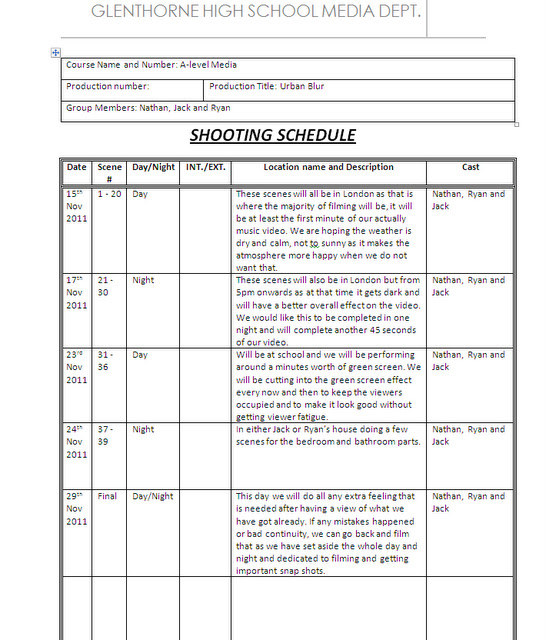
Shooting Schedule
Friday, 11 November 2011
Track Release Form


Tuesday, 8 November 2011


Subscribe to:
Comments (Atom)